Many phenomena can help flatten the epidemic curve and it is therefore very important to include them in our models. Practically, how do we do that?
We are going to answer this question using the tools and practices of mathematical epidemiology. In all simplicity of course.
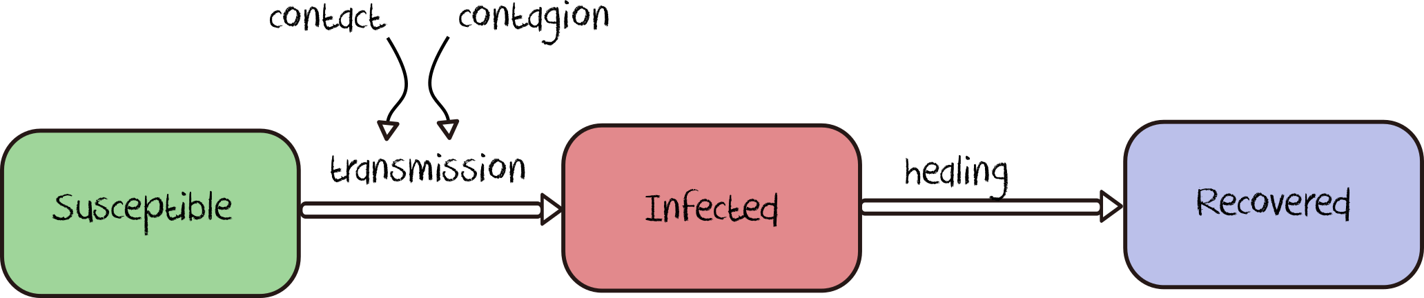
Let’s take the textbook case of a model where individuals of a given population can be either healthy (and so susceptible to being infected), infected, or recovered. We find here the main components of most models developed on this website. In the jargon of epidemic modelling, we talk of the SIR (S for Susceptible, I for Infected and R for Recovered) model. This type of model is a classic of mathematical modelling.
In most of the questions already answered on this website, we were interested in a limited number of interacting individuals, whose individual behaviour was represented. In case we want to model entire populations (at the scale of France as a whole, or Europe or the world for example), it makes little sense to represent each individual’s behaviour, unless there are particular reasons to.
We instead consider population clusters to be homogenous in respect to their characteristics and behaviours, and purposefully limit the number of parameters: besides the initial population in each state S, I and R, we keep the contact rate, the rate of transmission, and the recovery rate.
Naturally, the rate of transmission and the recovery rate are parameters which depend on the disease as well as one the protected measures deployed. They are estimated from empirical or theoretical data collected from different countries since the beginning of the epidemic.
This type of model, which assumes (the strong hypothesis) that everyone will behave, get infected and develop the disease in the same way, is mostly expressed as mathematical equations. However, it is sometimes very useful to express it graphically.
The basic idea is very simple in theory (even though it is less so in practice): from an initial situation (for example 100,000 healthy people and 1 infected person) we compute the evolution of the number of healthy, infected and recovered people from their known quantity at the previous step in time as well as our two mechanisms of transmission and recovery.
Once the model is built, we find the epidemic curves we are looking for by solving the model analytically: we can now follow the evolution of the number of susceptible, infected and recovered people as a function of time.
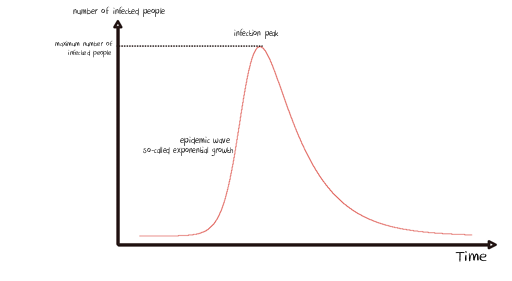
From there and by fixing the initial conditions (i.e. the same quantities of susceptible, infected and recovered people at the start of the simulation), we can play with each parameter (the contact rate, contagiousness rate and recovery rate) to study its effect on the shape of the curves obtained.
A lockdown scenario will lead us to define a contact rate below the one used as a benchmark, in the hypothesis that things run otherwise “normally”. This way, setting a period of lockdown during our virtual epidemic will disrupt the epidemic curve.
If the simulator window appears truncated, just zoom out.
Simulate the impact of lockdow on the epidemic curve
You might wonder how we estimated the contact rate before and after lockdown: come this way!
Everything we’ve presented so far may look easy on paper… Except this: how do we actually estimate this contact rate before and during lockdown?
It is a peculiar question, isn’t it? On average, how many interactions do we have each day with other people? Obviously, we only consider interactions which imply a physical proximity with other people, thus allowing transmission of the virus. It seems obvious at first sight that this value has to vary enormously between a Parisian (or a New Yorker, a Shanghaian, etc.) who takes the metro/tube/subway at peak hour and someone who lives as a hermit in Lozère (or Idaho, or the Sichuan). However, we have to find an order of magnitude which can characterise our population as widely as possible (remember: we assume that all individuals behave in a similar way).
A study conducted in several European countries in 2007 brought an interesting statistic to light. It surveyed 7290 participants picked at random. Using logbooks of their interactions over a single day, participants reported a total of 97,904 close interactions. The main result was therefore that the average number of proximate contacts was 13.4 per person and per day. This is an interesting one for our model isn’t it?
What about the same parameter during lockdown? If people comply strictly, they spend most of their time at home and respect social distancing when they have to go out, so the contact rate should tend to zero shouldn’t it? If you have read questions 2 and 6, you already know that it is not that simple…
We are not able to find a precise answer to this question in the literature. Therefore we fix a default value of one, a single contact per person and per day on average during lockdown, so ten times less than usual.
How do we translate these two values (~10 and ~1 contact) to our model? Let’s see.
We already know that at each step of the simulation, a certain number of people will leave the stock of susceptible people to be counted as infected. This quantity depends on four elements:
- The number of susceptible people in the population
- The number of infected people in the population
- The contact rate
- The rate of transmission
The number of contacts an infected person will have with a susceptible individual at each step of the simulation corresponds to the multiplication of three terms: Number of Susceptible x Number of Infected x Contact rate.
If we go back to our initial situation (100,000 Susceptible and 1 Infected), in order to arrive at 10 contacts between an infected person and susceptible others at each time step, we have to define a contact rate of 0.0001 since 100,000 x 1 x 0.0001 = 10.
Of course, this value does not account for the interactions among susceptible people and among infected people. The interactions within groups (susceptible, infected or recovered) or with recovered people are not part of this computation.
Besides, the number of susceptible people evolve with time, and so does the number of infected or recovered people. The number of interactions will thus naturally evolve during the epidemic. This is easy to grasp, because the less susceptible people, the less interactions there can be between infected and susceptible people (this is, by the way, one of the principles behind herd immunity, as you will see in question 8).
If you have read our explanation carefully, another question might arise… Do you have it?
This computation is indeed updated “at each step of the simulation”. But what does the time of the simulation represent in our case?
This could (maybe) be the subject of another post ;)
In the meantime, if you want to know more about mathematical modelling of epidemics, we recommend you read this report written by one of the best research teams in the field.
It is as simple as that.
Reminder: the models developed on this website are for educational purposes only. They are a lot simpler than models built and deployed by other teams working on COVID-19. They are not substitutes for these reference models and cannot be used to make diagnoses or forecasts. Our goal instead is to raise awareness about this epidemic and its drivers.